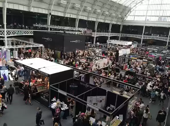

Trade shows are one of the few marketing channels where your entire budget is spent in a single weekend. There's no A/B testing on a live event floor, no second chance if the design misses the mark, and no way to quietly fix a mistake mid-show the way you might pause an underperforming ad campaign. That makes exhibition ROI one of the highest-stakes numbers in a marketing calendar and, oddly, one of the least strategically managed.
Most companies still measure trade show success by counting leads scanned or business cards collected. Booth traffic gets reported, a follow-up email sequence goes out, and the show gets filed away as "a good one" or "a quiet one" with little analysis of why. What's usually missing from that conversation is booth design itself treated as a cost line item, when it's actually one of the biggest levers on the entire outcome.
It's tempting to think of a stand as branding, logo, colors, a few product displays, done. But a booth is functioning as a filter, a signal, and a conversation-starter all at once, usually within the first three to five seconds someone spends looking at it from the aisle.
In that window, a visitor is deciding three things, whether they realize it or not:
Get any one of those wrong, and a genuinely good product never gets the chance to make its case. That's the part of ROI that spreadsheets miss: you can't convert a lead who never stopped walking.
Not every design decision carries equal weight. A few consistently show up as the difference between a stand that pulls people in and one that gets walked past.
Open sightlines over enclosed structures: Visitors instinctively avoid spaces that feel like they require "committing" to enter. A stand with a clear line of sight from the aisle to the back even a modest one invites a glance that can turn into a conversation. Closed-off reception counters at the entrance are one of the most common and easily fixed mistakes.
Directional lighting over flat, even lighting: On a packed show floor lit uniformly by ceiling rigs, everything starts to blur together after twenty minutes of walking. A stand with one or two brighter focal points a backlit graphic, a spotlighted product creates the contrast that catches a tired attendee's eye from a distance.
Fast, clear messaging over clever messaging: If a passerby doesn't understand what you're doing in Two Bits, most citizens will not stop revealing it. Stuck on something? The message has an internal signified that often means nothing to someone who meets the mark for the First time.
Modular flexibility over one-off custom builds — for repeat exhibitors: Companies attending multiple shows a year often get better cost-per-lead from a well-designed reusable modular system than from repeated custom builds, simply because the same investment gets reconfigured and reused rather than discarded after one event. Custom builds still make sense for flagship launches where unmistakable brand impact matters more than repeatability but that's a strategic choice, not a default.
Consider a mid-sized exhibitor who had used the same basic setup — a pop-up banner and a folding table — for two years running, with modest results: a steady but unremarkable trickle of conversations each day.
Rather than a full rebrand, three targeted changes were made:
Nothing about the product, the team, or the budget changed. What changed was how easily a stranger could understand, from a distance, whether it was worth stopping. Conversations at the next show nearly tripled, not because of a bigger investment, but because friction between "person walking past" and "person who understands what you do" was removed.
That's the practical shape of exhibition ROI: it rarely comes from spending more. It comes from removing the small frictions that quietly cost you conversations you never even see happen.
Before your next show, it's worth running your own stand or your exhibitor brief, if you're managing a team through a short gut-check:
None of these require a bigger budget to fix them. They require making design decisions on purpose, rather than by default or by whatever was quickest to approve.
One trend worth tracking: more exhibitors and increasingly, more show organizers are factoring sustainability into stand decisions, not purely as a values statement but as a genuine cost and waste consideration. A modular stand reused across five shows a year isn't just cheaper per event; it also avoids the material waste of a custom build that's dismantled and discarded after a single weekend. If your company has any environment-related commitments, you must bring them up during the initial communication stage with your booth partner; do not wait until the design plan is completely finalized to mention them. If you try to make changes at that point, not only will you have to spend extra effort on adjustments, you may even be unable to make changes at all, wasting the chance to implement your environmental commitments in vain.
Exhibition ROI ultimately isn't decided in the follow-up email or the lead-scoring spreadsheet, useful as those are. It's decided the moment someone thirty feet away, without fully realizing it, chooses whether your stand is worth walking toward. Get that decision right more consistently, and everything downstream gets easier.